First a disclaimer. I could probably sit on this site for another 3 months tinkering with it. There’s still a few bugs I know about that need to be fixed and a long list of improvements / added features I indeed to get to. However, after a little encouragement from some good friends I knew it was time to get it out in the open and see what people think of it. I’ll continue to improve it over the next few months but for now (I guess) I’m happy with it.

Just before the New Year I decided it was time to redesign my site. Initially I planned to just make the old design responsive but the markup and CSS weren’t great (damn former me – although to be fair I was still learning CSS) and I didn’t really like the design that much anyway so decided it was time for a fresh start.
I came up with a few ideas of how I wanted the site to work and sketched them down. However, when I tried to translate these ideas into designs they never quite looked as slick as they did in my head.
During this time one of the designers at Fi, Tobias van Schnieder, had just moved from the Stockholm office to NYC. I explained my predicament to him, showed him my sketches and asked if I could pick his brain on design stuff once I had something half decent in Photoshop. The very next day, without me asking, he came in with designs for me!
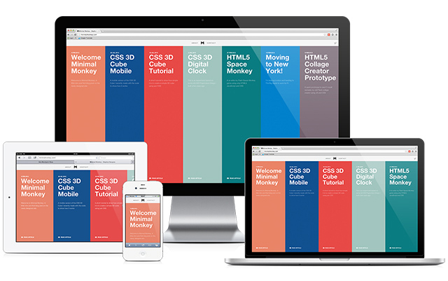
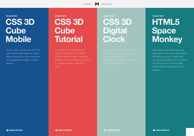
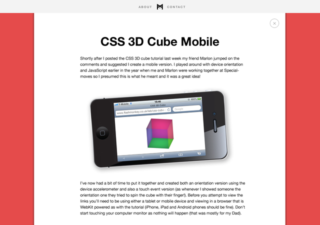
I loved the stuff Tobias came up with and you can see from the screenshots below that the final site changed very little from his original designs.


A couple of people I spoke to thought it was a little strange that, being a web developer, I didn’t design my own site. However, I have to disagree. Let me put it this way, if I was going to build my own house I’d get an architect to design it otherwise I’d end up living somewhere like this.
One of the main requirements for my site, which I think Tobias got spot on, was that I needed something to look great but I don’t necessarily have lots of nice images that I can use. Plus prepping graphics for a blog post takes time and might put me off adding content. I was worried that without images my blog would just look plain and boring but, with the colors, I think it looks great!
Another great thing about the designs is that all my old blog posts from over the past few years fit nicely with minimal work required to integrate them. Whether they should all still be here is another debate and I may well delete some of the older, now irrelevant posts.
Flash Monkey alias retires
People that used to visit my old site will obviously notice the change of alias / domain. I’ve been debating whether to get ride of old Flash Monkey for sometime now. It’s been about a year since I did any Flash / ActionScript work and I really don’t see that changing in the future. I’m not going to declare Flash is finally dead (although, perhaps in terms of use for websites it is, but that’s a whole other topic) but for me and my day to day work it certainly isn’t relevant anymore.
I think the thing that finally pushed me over the edge is that since LinkedIn added the endorsements feature people keep endorsing me for Flash related skills! I don’t do Flash anymore, stop endorsing me for it!
Anyway, Flash has played a big part in my career and I learn’t a lot of skills that I still use in JavaScript and CSS every day. I’ll be keeping my old blog up as it still (strangely) gets a fair few hits but going forward I’ll only be posted on this site.
Thanks Tobias
So a huge thanks to Tobias for the awesome designs and also for keeping me motivated and pushing me to get the site to the point it is today. Also, some appreciation to my girlfriend Junith who’s been patient over the past month whilst I’ve spent many evenings putting this site together. All the late nights reminded me of why I stopped doing freelance on the side many moons ago.
Now I need to start writing regularly to make all the work worthwhile! I’m planning a series of posts about stuff I’ve learnt whilst making the site so watch this space.